The Mobile Layout Debate
📱The five objects that win mobile checkout, when posting more helps and when it stops helping, and more!
Howdy Readers 🥰
In this newsletter, you’ll find:
📱 Mobile Checkout Above-the-Fold Warfare: The 9-Second Triage That Stops Abandonment
💬 The New Social Advantage, Talk Back And Post Smarter
🏆 Ad of the Day
If you’re new to ScaleUP then a hearty welcome to you, you’ve reached the right place along with 50k+ CEOs, CMOS, and marketers. Let’s get into it, shall we? Oh! Before you forget, if someone forwarded this newsletter to you, don't forget to subscribe to our newsletter so you never miss out!
Together with Lindy
Give Your Marketing Team Superpowers with AI Agents
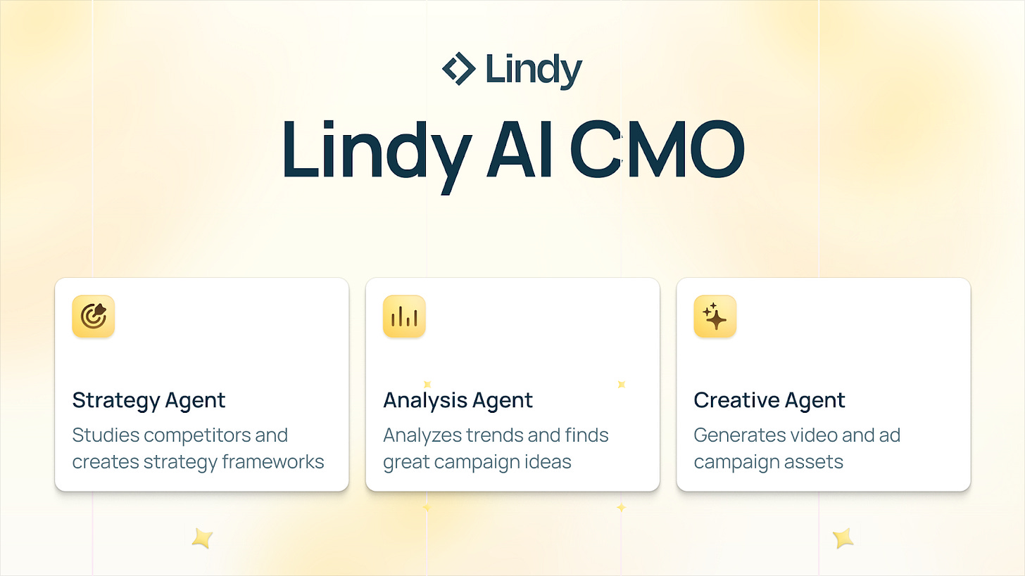
Lindy AI CMO is a suite of powerful agents that ship beautiful marketing campaigns quickly.
Simply enter your business’s website, and watch AI agents study competitors, create messaging docs and campaign briefs, and generate creative assets. Everything is automatically organized in Airtable, ready to deploy.
With Lindy, marketing isn’t a grind; it’s a system that runs 24/7, handling strategy, analysis, and creative work while you focus on growth.
See AI Agents in Action Today!
📱 Mobile Checkout Above-the-Fold Warfare: The 9-Second Triage That Stops Abandonment
Mobile checkout is not a form. It is a stress test. The buyer is not “reading” the first screen; they are scanning for danger, effort, and loss of control. If the first screen fails that scan, the brand never gets a second chance, because mobile exits are impulsive and final.
The Warfare Reframe: Above the Fold Is a Fear-Removal Device
Most teams design checkout like a layout problem. Operators treat it like crisis management. The first screen must do three jobs in order: remove fear, reduce effort, and then preserve control. Any element that does not serve one of those jobs is stealing oxygen from conversion.
The 9-Second Triage Model (What the First Screen Must Prove)
Step 1: “Am I about to get surprised?”
Above the fold must show the cost truth immediately. Not “subtotal,” not “calculated at next step,” not a collapsed summary that hides the punchline. The fastest way to kill mobile checkout is by making the buyer feel like the real price is hidden later.
Step 2: “Is this going to be annoying?”
Effort must collapse fast. Express options belong on the first screen, always, because they turn checkout from a task into a tap. If express buttons exist but are below the fold, the page is accidentally training the buyer that purchasing here requires work.
Step 3: “Can I undo this if something feels off?”
Control signals must be visible, not buried. Edit cart, back navigation, support access, and return clarity should appear as tiny confidence cues. The goal is not to educate, it is to prevent the panic impulse that triggers abandonment.
The Priority Stack (What Goes Where, Ruthlessly)
Above the fold should contain only five objects, in this exact order:
The fastest pay path (express)
The price truth anchor (total or near-total with shipping clarity)
A single primary next step (continue)
A micro trust cue (secure checkout or payment protection)
A micro control cue (edit or help)
Everything else gets demoted. Promo fields, long summaries, badges walls, “nice” branding elements, and extra form fields are not harmless; they are distraction debt.
The Two Tradeoffs Most Brands Get Wrong
First, they let the order summary dominate the first screen because it feels “transparent,” but it actually delays action. Transparency is not more information, it is faster certainty. Second, they lead with a heavy form field because it feels “logical,” but logic is not the goal; momentum is.
The Execution Edge: Make the Page Feel Like One Tap Away
The first screen should feel like the buyer is already halfway done. That means minimal text, one clear path, and no signals that suggest this checkout is meant for businesses, accounts, or long processes. On mobile, the best checkout copy is not persuasive; it is relieving.
💬 The New Social Advantage, Talk Back And Post Smarter
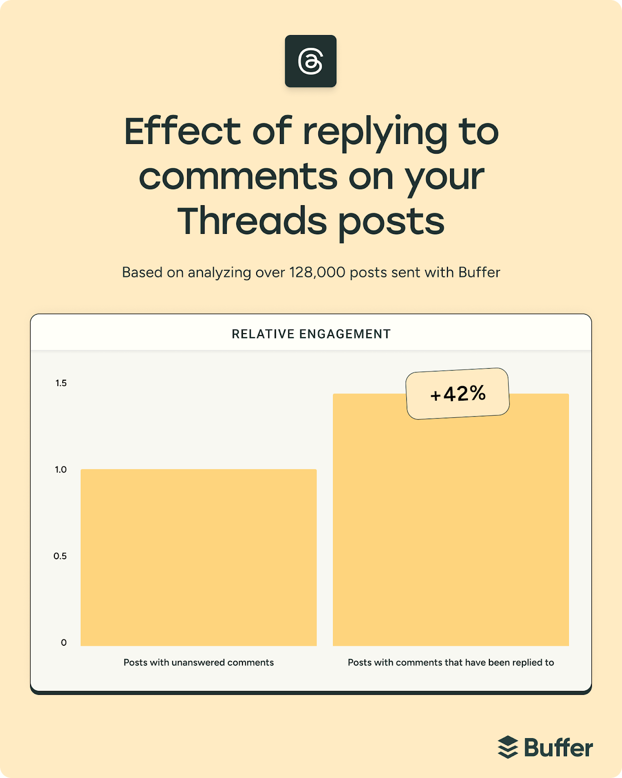
Buffer’s data scientist Julian Winternheimer studied nearly 2 million posts to see if replying to comments actually lifts results. Then he analysed 11.4 million TikToks to answer the biggest consistency question: how often should you post? The patterns are simple and very usable.
The Breakdown:
1) Threads, LinkedIn: Replying is a real lever; Threads posts with replies saw 42% higher engagement across 128K posts, and LinkedIn saw a 30% lift across 72K posts. The analysis compared each account to itself over time, so big pages did not skew it.
2) IG, FB, X: Instagram posts with replies averaged 21% higher engagement across 700K posts, Facebook added 9% across one million posts, and X showed about an 8% lift. X is slightly noisier because far fewer posts had replies, but the direction matched all others.
3) TikTok sweet spot: The best effort to payoff jump is going from one post a week to 2–5 posts a week, which can lift views per post by up to 17%. Posting 6–10 can reach 29%, and 11+ can reach 34%, but the returns shrink each step.
4) Why “more” works: TikTok does not reward you by raising your average post; it rewards you by giving you more chances to hit a breakout. Median views stay around ~500, but the top 10% explodes, p90 rises from 3,722 with one post to 14,401 with 11+ posts.
For DTC and marketing teams, this is a clean operating rule: reply more on conversation-heavy platforms, then run TikTok on a steady 2–5 posts a week cadence. You will grow faster by stacking compounding behaviours than by chasing random hacks.
🏆 Ad of the Day
What Works:
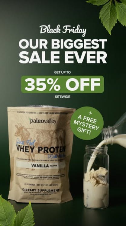
1) The ultra-dark green background - Green is the colour of vitality, growth, and nourishment, and using a deep shade creates subconscious trust in purity and health. It makes the whey protein feel less like a supplement and more like a whole-food ritual.
2) “BIGGEST SALE EVER” - “Biggest ever” isn’t about size; it’s a dominance cue, signalling a once-a-year event where not participating feels irrational. The phrase creates an anchor effect: viewers assume typical savings are smaller, making 35% suddenly feel huge.
3) The mystery gift - Mystery activates curiosity gaps, which are neurologically harder to ignore than known rewards. The circle badge is intentionally placed near the pour, tying excitement to usage. Viewers mentally “receive” something before they buy — reducing hesitation.
This ad wins because it unites primal health cues, movement-driven sensory imagination, and high-stakes sale framing into a single, cohesive emotional story. It sells not protein, not a discount, but the feeling of choosing the cleanest, smartest, most “natural” path during the biggest moment of the year.
Advertise with Us
Wanna put out your message in front of over 50,000 best marketers and decision makers?
We are concerned about everything DTC and its winning strategies. If you liked what you read, why not join the 50k+ marketers from 13k+ DTC brands who have already subscribed? Just follow this.
At ScaleUP, we care about our readers and want to provide the best possible experience. That's why we always look for ways to improve our content and connect with our audience. If you'd like to stay in touch, be sure to follow us EVERYWHERE🥰
Thanks for your support :) We'll be back again with more such content 🥳


