
That Beautiful Email Killed CTR
📧 The most beautiful email you ever sent probably killed your click rate, Media buyer index of the week, and more!
Howdy Readers 🥰
In this newsletter, you’ll find:
📧 The Most Beautiful Email You Ever Sent Probably Killed Your Click Rate.
📊 CAC Improved Almost Everywhere, But Conversion Rates Tell a Different Story
🏆 Ad of the Day
If you’re new to ScaleUP then a hearty welcome to you. You’ve reached the right place along with 50k+ CEOs, CMOS, and marketers. Let’s get into it, shall we? Oh! Before you forget, if someone forwarded this newsletter to you, don't forget to subscribe to our newsletter so you never miss out!
📧 The Most Beautiful Email You Ever Sent Probably Killed Your Click Rate.
There’s a specific kind of marketing postmortem nobody wants to have.
The beautiful email went out. Full-width hero. Immaculate typography. Brand colors dialed in perfectly. The designer sent a proud Slack message.
The open rate looked solid. Then the click-through came back at half the rate of the scrappy plain-text sent three weeks earlier, and the room went very quiet very fast.
Nobody scheduled a debrief. Nobody asked why. The next email brief went out with the same template.
That silence is where conversion rate goes to die.
Design is traffic control. Most brands are using it to redecorate.
Every layout decision is a decision about where the reader’s eye goes next. When design gets treated as aesthetics rather than architecture, that path gets built around what looks impressive rather than what converts.
The result is an email that asks the reader to make twelve visual decisions before reaching the one that matters:
Multiple hero images because the product range deserves representation
A brand story block because the copywriter worked hard on it
Two CTAs because there are two things worth promoting this week
Social proof banners because they test well in landing page research
The reader opens the email and faces a visual negotiation. Most don’t reach the conversion point — not because they’re uninterested, but because the layout trained their eye to wander before it knew where to land.
Why plain-text keeps winning against production budgets.
The plain-text email doesn’t win because readers prefer ugly. It wins because it eliminated every visual decision except one. Nothing to look at but words. Words lead to a link. The link is the only destination available.
Richness and conversion pull in opposite directions. Every visual element either directs attention toward the CTA or competes with it. There is no neutral design choice in an email. Every element is either helping or hurting, and most templates are packed with elements nobody has audited for their actual directional effect.
The mobile fold problem killing click rates silently.
Most email templates get designed on desktop. Most emails get read on mobile. That gap is where a significant portion of click rate disappears without anyone diagnosing why.
On desktop the CTA sits comfortably in the upper half. On a 375px mobile screen that same CTA is buried below three product images, a headline block, and a paragraph of copy the reader has to scroll past before knowing there’s anywhere to click.
Sixty percent of readers opening on mobile won’t scroll past the first screen. Before any email goes to design, one question needs an answer: does the CTA exist on the first screen of a 375px phone? If not, the layout is optimized for the device the team uses to build it, not the device the audience uses to read it.
Visual hierarchy is a conversion tool being used as decoration.
Font size, weight, and contrast create a reading sequence whether the designer intends them to or not. When the CTA button carries the same visual weight as the product headline, the reader’s brain processes them as equally important. That equivalence is the friction being measured in the click rate every week.
The CTA should be the most visually dominant element in the email. Everything above it builds the argument for clicking it. Everything placed after it is competing with the action that was supposed to happen there.
Design is the traffic cop. Build the layout like one.
📊 CAC Improved Almost Everywhere, But Conversion Rates Tell a Different Story
Intro Last week delivered one of the broader CAC improvement sweeps in recent months, with most platforms showing lower acquisition costs, yet conversion rates dropped sharply across several of them, raising questions about what’s actually driving the efficiency gains.
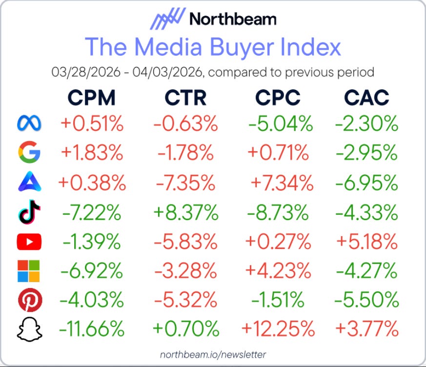
The Breakdown:
CPC - Meta, TikTok, and Pinterest saw click costs fall while AppLovin, Snapchat, and Microsoft pushed higher, where CPCs dropped alongside CAC. Lock in current audience segments before auction pressure rebuilds and closes the window.
CAC - Meta, Google, AppLovin, TikTok, Microsoft, and Pinterest all improved while YouTube and Snapchat worsened, broad CAC gains alongside falling CVR suggest external demand is doing the work, so hold campaign structure until the signal proves durable.
ROAS - Meta led at +3.97%, and Microsoft posted +5.10% while YouTube dropped -5.37%. YouTube’s simultaneous CVR and ROAS decline makes it the clearest candidate for a creative refresh before adding any budget back.
Meta held 65.00% share and Google grew to 25.89% while Snapchat surged +21.33% in share despite a -14.68% CvR collapse, Snapchat’s share jump without conversion support is a red flag worth investigating before that spend compounds, and AppLovin’s +10.46% CvR gain at 2.42% share remains the most underleveraged efficiency signal on the board.
🏆 Ad of the Day
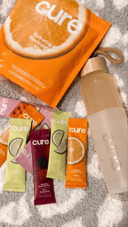
What Works:
The Hidden Conversion Mechanism
This ad sells environmental context, not product benefits. The towel texture, soft lighting, and scattered sachets recreate a post-beach or recovery moment, making the product feel like it belongs in a specific lifestyle, not a supplement shelf.
The variety spread signals exploration without commitment, lowering the risk of choosing wrong by showing multiple flavors upfront. It feels like sampling, not buying.
The bottle + sachet combo creates a ready-to-use system, not a standalone product.
Don’t isolate your product. Place it inside a moment people already crave, and let that context do the convincing.
Advertise with Us
Wanna put out your message in front of over 50,000 best marketers and decision makers?
We are concerned about everything DTC and its winning strategies. If you liked what you read, why not join the 50k+ marketers from 13k+ DTC brands who have already subscribed? Just follow this.
At ScaleUP, we care about our readers and want to provide the best possible experience. That's why we always look for ways to improve our content and connect with our audience. If you'd like to stay in touch, be sure to follow us EVERYWHERE🥰
Thanks for your support :) We'll be back again with more such content 🥳