
Dopamine trap killing your ads
Attention without structure dies fast, YouTube’s Brand Pulse helps measure full brand impact, and more!
Howdy Readers 🥰
In this newsletter, you’ll find:
🪝What Comes First: The Hook or the Hit?
📊 YouTube Unveils Brand Pulse
🏆 Ad of the Day
If you’re new to ScaleUP then a hearty welcome to you, you’ve reached the right place along with 50k+ CEOs, CMOS, and marketers. Let’s get into it, shall we? Oh! Before you forget, if someone forwarded this newsletter to you, don't forget to subscribe to our newsletter so you never miss out!
Together with Grapevine
🔥 Stop writing briefs. Stop chasing creators. Performance UGC on demand.

Creator UGC lowers CPAs by 20% vs. branded ads and unlocks new audiences.
Grapevine is trusted by top consumer brands to scale performance UGC and whitelisting on Meta, TikTok, and Google.
Grapevine’s fully managed service gives you a dedicated brand success manager and handles everything, from creative ideation, creator sourcing, editing, and launch strategy.
Just Food for Dogs scaled Grapevine assets from 15% to 45% of paid media in 6 months
Madison Reed unlocked 20% efficiencies over Target CPA and 50% higher LTV
Mathnasium cut Meta CPL by 33% in under 30 days
Test Grapevine today and scale learnings ahead of BFCM to unlock efficiencies during the most competitive season.
Book a free strategy call by Oct 22nd and get one additional creator (10+ new ad variations) freez!
🪝What Comes First: The Hook or the Hit?
We’ve all been guilty of chasing the dopamine.
You find a scroll-stopping visual. A curiosity-pulling line. An ad that feels like a winner. But then, nothing. High clickthrough, zero sales. Why? Because in the race to win attention, you forgot to sell.
This is the hidden cost of bad sequencing. You placed the hook where the hit should’ve been. And your best buyers? They bounced because they never even saw the part meant for them.
Attention ≠ Action
A good hook might stop the scroll. But a good structure turns that attention into belief, and belief into behavior.
You can write the sharpest copy, shoot the best UGC, or throw every angle you’ve got into a single ad. But if your sequencing is off, if the viewer sees flair before foundation, or specs before transformation, they won’t know what you’re really offering until it’s too late.
This doesn’t mean “hook first” is wrong. It means that what comes next matters even more.
Your ad, your landing page, your PDP, they aren’t a canvas for creativity. They’re a narrative machine. And narrative machines work best when they’re built in the order that the customer’s brain expects:
Transformation → Proof → Specifics
That’s the natural curiosity ladder. Show them the dream. Prove it’s real. Then walk them through the “how.”
And yes, there’s a way to test if your sequence is actually working. Tools like Neurons let you upload your ad creative and get real-time attention scores, showing you whether your transformation, proof, or CTA is being seen in the right order before you ever go live. You can start your 14-day free trial with Neurons and know what hits before you launch.
When Sequencing Breaks: 3 Real Examples
1. Landing Pages That Lead with Specs
We’ve seen skincare brands open with ingredient lists before showing skin results. Supplement brands flaunt certifications before showing outcomes. The result? You educate, but don’t convert.
2. Emails with Wasted Preheaders
Marketers obsess over subject lines, but often overlook the 80–120 characters that follow. A great preheader can double open rates by resolving curiosity or teasing a payoff. Most waste it on “Can’t see this email? View in browser.”
3. Ads That Front-Load Proof Without Context
Imagine opening with “Over 20,000 sold!” before telling people what the product does. That’s social proof with no anchor. People tune out because they never understood what’s in it for them.
The Real Work Is Prioritization, Not Polish
This is where most brands mess up. They think the fix is sharper copy. Or louder visuals. Or more “wow.” But the real unlock is ruthless prioritization.
Ask yourself: if the buyer only reads the first 5 seconds of this asset, do they understand what’s in it for them? Do they feel something? Would they scroll down?
If not, restructure. Don’t rewrite. Start with impact. Back it with proof. Land with clarity. Don’t just hook. Land the hit.
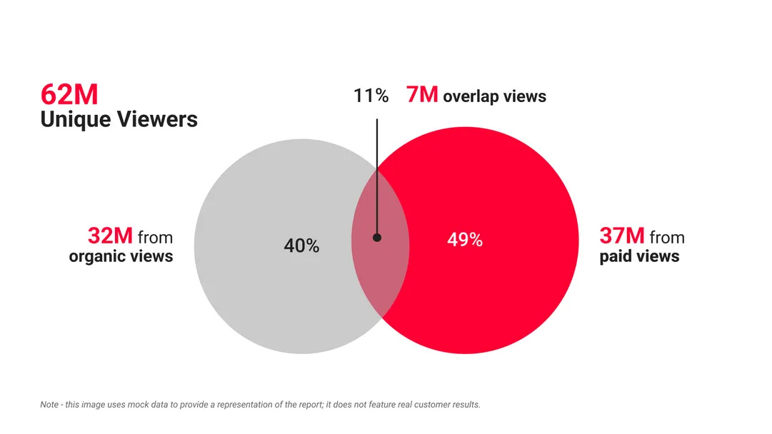
📊 YouTube Unveils Brand Pulse: Measuring Every Corner of Brand Impact
YouTube has launched the Brand Pulse Report, an AI-powered tool designed to give marketers a unified view of how their brand appears across the platform. For the first time, it brings together paid ads, creator collaborations, organic uploads, and user-generated content under a single measurement system.
The Breakdown:
1) AI that sees, hears, and reads your brand - Brand Pulse uses multi-modal AI to detect brand mentions across audio, visuals, and text, from spoken references and on-screen logos to captions and packaging. It then ties these signals to engagement metrics like Total Unique Viewers and Share of Watch Time, capturing both intentional and organic exposure.
2) From visibility to real-world behavior - The report tracks Search Lift, showing how brand appearances on YouTube influence search behavior and intent. This bridges the gap between awareness and measurable consumer action.
3) Closing the measurement gap for marketers - For years, YouTube metrics lived in silos, with ads, creators, and organic content tracked separately. Brand Pulse unifies these threads, helping teams understand how paid efforts amplify organic reach and where collaborations or placements deliver incremental lift.
For advertisers, Brand Pulse helps solve one of video marketing’s biggest blind spots, quantifying the ripple effect of brand exposure. It unifies paid, creator, and organic touchpoints to show how each amplifies the other, guiding smarter investment decisions. Currently in limited rollout, Brand Pulse marks a major leap toward holistic brand measurement, moving beyond clicks to capture total influence and brand presence.
🏆 Ad of the Day
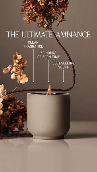
What Works:
1. Cinematic Stillness as a Luxury Cue - Nothing moves here, no bright colors, no heavy contrast, yet it commands attention. That stillness is intentional. The matte gray candle, the muted brown florals, and the neutral backdrop mimic fine-art photography. In premium categories, stillness is a status signal. Quiet composition reads as confidence, a brand that doesn’t need to shout to sell.
2. Implicit Lifestyle Framing - Notice what’s missing: no model, no home interior, no props beyond nature and product. That absence creates universality. It lets the viewer project their own space, making the product adaptable to every aesthetic, minimalist, boho, or modern.
3. Micro-Sell Through Precision Labeling - Rather than a cluttered feature list, the ad uses three measured callouts (“Clean Fragrance,” “60 Hours of Burn Time,” “Best-Selling Scent”). In wellness or slow-luxury brands, your copy rhythm must mirror your product’s emotional promise. Write like your brand breathes.
This isn’t a candle ad, it’s a masterclass in energy calibration. Every design choice works in tonal harmony: muted palette, slow typography, tactile imagery, and whisper-like copy. It sells not a product, but a state of mind.
Advertise with Us
Wanna put out your message in front of over 50,000 best marketers and decision makers?
We are concerned about everything DTC and its winning strategies. If you liked what you read, why not join the 50k+ marketers from 13k+ DTC brands who have already subscribed? Just follow this.
At ScaleUP, we care about our readers and want to provide the best possible experience. That's why we always look for ways to improve our content and connect with our audience. If you'd like to stay in touch, be sure to follow us EVERYWHERE🥰
Thanks for your support :) We'll be back again with more such content 🥳